__________________________________________________________________________________________________

__________________________________________________________________________________________________
Research for my On Location project


__________________________________________________________________________________________________
Primary Research for Mott MacDonald
As part of our assessment we were told to contain primary and secondary research.
For my primary research we were able to visit the Mott MacDonalds head office at 22 Stations Rd, Cambridge CB1 2JD
We were able to see the walls in which our art work would be placed and the overall design of the architecture.
From this trip i was able to understand and take in the style of images i could produce for their offices. Something colourful, striking and breathtaking.
__________________________________________________________________________________________________


These edits took a considerable amount of time to complete. To create the outline effect i used photoshop to select round the plant and then i created a new layer via copy then used blending options and clicked stroke. This gave me the effect i desired, then i went on to darken the background away from the plants which i had selected. Finally i added the text MOTT MACDONALD and used the hue effect to bleach out the image to enhance the relationship between Art Nouveau.
__________________________________________________________________________________________________
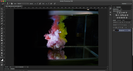

This was a simple edit, erasing all the parts of the tank which were still showing using the paint tool in black, this produces the effect that the photographer in which I researched had used. For the final result and edit I used photoshop to flip the image upside down, this adds to the abstract look. Later on i decided to edit the final image with the hue/colourize button on photoshop completely changing the final result.
__________________________________________________________________________________________________
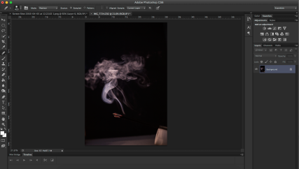

Too begin this edit i decided to increase the contrast to boost the clarity of the smoke. Most of the editing was completed in photo RAW, boosting the whites in the image and darkening the back drop. To finish the photo i cropped the image to boost the size of the smoke in relation to the background.
__________________________________________________________________________________________________
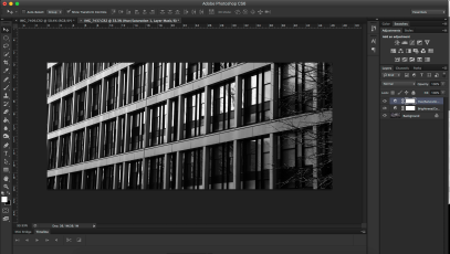

To edit the ‘Abstract Architecture’ photographs i want to eliminate all the sky, this would enable the image to become more in depth and also helps achieve the task of becoming more abstract. Turning the image black and white enhances the contrast bringing out the lines of symmetry.
___________________________________________________________________________________________________
Storyboard Using Film

For this task we where asked to create a story using a length of 36 exposure film. As we where using film we where told to plan the story on on an A3 piece of paper with 36 blanks. This ensured that we could produce the best work possible. I divided 36 by 6 to give me an element of choice when it came to enlarging my finals. Unfortunately my 4th row of film was a little fogged this may have been due to opening the camera prematurely or when developing the film.
___________________________________________________________________________________________________
Lighting Effects
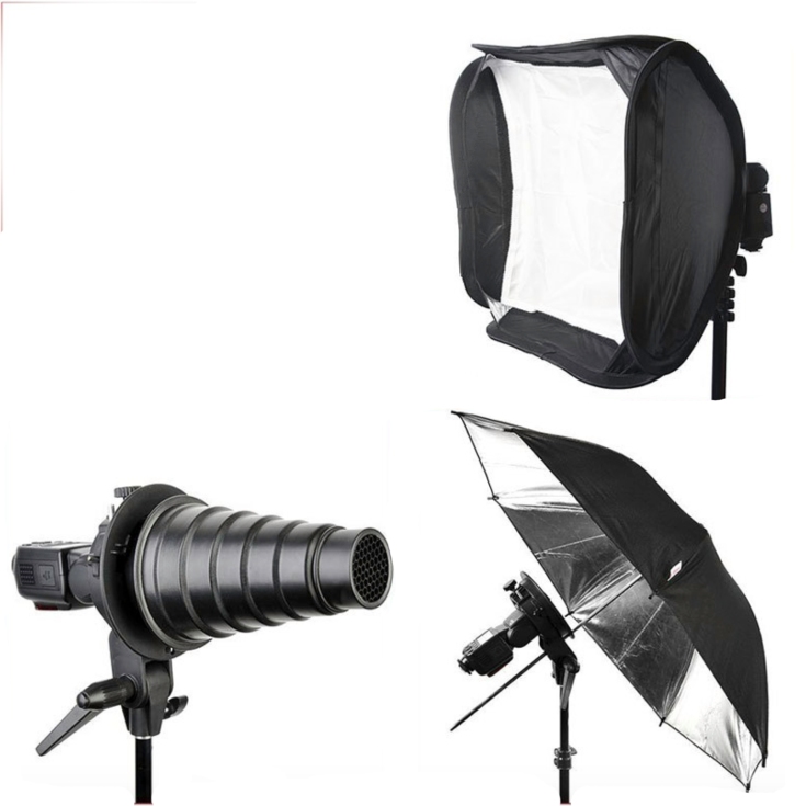
These are the 3 different types of lighting we have used, Softbox, Snoot and umbrella lighting, these lights are used in a variety of different combinations and create different effects. The Softbox is used to diffuse the harsh light that comes straight from the flash and is the most common. The snoot directs a small circle of light used to direct the focus of an image, however it is a very hard light and shows imperfections well. The umbrella attachment is used to disperse the light to a wide area and i usually used in a combination with one of the other two.
___________________________________________________________________________________________________
Media Make up 6
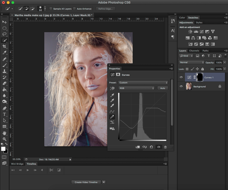
To edit this image I used the curves tool this is a tool I have previously not used, I selected the background and then used the refine edge tool, this tool makes it easy to select all the small separate strands of hair. I could then experiment with the curves tool, within the curves tool I used the pen tool to allow me to give a freehand wave. To finish the edit I used the crop tool and increased the contrast.
___________________________________________________________________________________________________
Autumn Swirl

This image was almost perfect. The way in which I took the photo mean there was very little to edit. However there is a perfect centre within this photo which needs to be found using the crop tool. Saturation and contrast where also boosted to bring the final to life.
___________________________________________________________________________________________________
Pink Veins

This image was by far the easiest photo to edit as the positioning and size where all correct. This only thing I did to this photo was played around with the Hue on the image. As the trees where silhouettes they will therefore not be affected by this change, this meant I didn’t even have to select the background.
___________________________________________________________________________________________________
Hooded Boy

For this final I selected the part of the face which I wanted to darken and then using the paint tool colour over the section with a low opacity and low hardness this will give the shadow shown in my final.
___________________________________________________________________________________________________
Laptop Portrait

As shown in the photo above this final image took some time to produce in the way I wanted it to look, As I had the image laid out in my head. This also makes editing easier and quicker. I added noise to the final image as I liked the effect it gave.
___________________________________________________________________________________________________
Phone Portrait
This image needed to be brightened and centred, in the crop tool in photoshop the centre is extremely easy to find as it is marked with a circle and a cross. The brightness tool on photoshop makes it simple to brighten the photo to the correct levels. I used the contrast tool to eliminate some of the models face as I didn’t want the models identity to be exposed.
___________________________________________________________________________________________________
Clouds ‘N’ Water

To edit this photo I used Photoshop, I firstly used the black and white tool to get a more dramatic effect. To make the black and white more prominent I used curves, this enhances the blacks and whites in specific areas to give a larger effect. Finally I cropped the photo down, this focuses the audience on a specific section of the picture as it eliminates all distractions.
___________________________________________________________________________________________________
