Search

TomWellsPhotos

Level 3 Photography Student

Category

Magazine Research

Final Evaluation

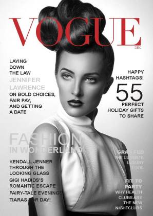
My WONN 17 magazine went well overall. I used a range of skills which i have learnt by re-creating notorious published magazine covers for example GQ and HUNTER. After my research I had already figured out a front cover. Overlaying an image on top of text produces a 3D effect which is powerful. The Serif typeface was an appropriate choice due to the easy legibility when printed due to the spacing. However once reviewing the magazine I identified that the font choice was very standard, if i was to re-design I would add some sans serif text to take the wight off the text. This will also give a more interesting viewing experience as the expression can change with the text. Most of my imagery was made up of landscapes, this added a challenge due to the magazine orientation being portrait. To overcome this issue I cropped imagery and also used body text to fill the negative space. Overlaying the body text over the top of a coloured rectangle added depth and provided a more interesting view due to using the paint dropper tool and selecting colours from an image which was on the same page.

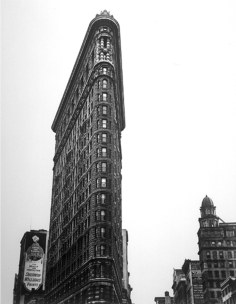
My aim was to show New York in the perspective of a tourist, therefore reflecting this in my imagery. I feel I achieved this aim and was able to create in-depth content within my magazine, showing examples of tourist places and New York history.

The magazine I produced had a very simple layout with both images and text separated, this look flat and undesirable. To give my magazine immediate effect I would redesign the page to integrate both text and imagery. Using text wrapping to curve text. Using a more complex grid system with defined margins and columns.

Magazine layouts

These images show a few different front cover designs, By using InDesign i used black to represent imagery and the white to represent text box.


Below are the double page spreads. Using the same colour code as for the front cover.

Using InDesign

Using the InDesign software I started by recreating posters. This gave me the opportunity to use the features that will be needed when creating my magazine. Using grids I could space my work correctly and this made recreating these posters a quick and easy task once I had practiced the technique a few times. This is based upon the work by the Swiss Graphic Designer Joseph Muller Brockmann who introduced the grid system.

I used different typefaces trying to accuratly match my work to the orriginals. I also used tryal and error to accuratly adjust the kurning, leading width and hight of each typface I used.

Screen Shot 2017-03-24 at 11.58.21

Screen Shot 2017-03-24 at 11.59.00Screen Shot 2017-03-24 at 11.59.07

Example InDesign

I-D 2Justin I-DI-DAsap I-DduaHunger 1imagesHunger 28a5db656-9fac-43dd-9ecf-58073b2eac7e_3.c4e5eba3fed80d69319069806fc01780VOGUE

Adam Goldberg

Adam Goldberg works within New York and uses his city knowledge to find high viewpoints creating a wide cityscape with a wide depth of field. His images capture the city at its full potential.

Humza Deas

Humza Deas is a New York city photographer who primarily displays his images using the platform Instagram. His imagery contains major subjects within New York such as Brooklyn bridge, Times Square and the empire state. Finding multiple different angles to locate the perfect image. The images all uses the rule of 3rds, having the subject within the  two sides forms a direction for the viewer.


Berenice Abbott

Berenice Abbott was born in July 17, 1898 and passed away on December 9, 1991, she was an American photographer based in New York City and was best known for her portraits of 20th century cultural figures. Abbott’s street photography consists of local knowledge within NYC and photographing these unknown hotspots. This adds to the detail of the imagery, due to the wealth of inside knowledge. Living in NYC meant that Abbott had time to study the city in depth allow her photography to become evermore powerful.


Screen Shot 2017-03-24 at 10.45.45

Development of ideas

For my magazine I will be undertaking the style minimalist. Combining the style with the theme from tourist view, combining street and architecture photography. I will use colours from the exciting pallet which will be select from within the imagery used. Using a collection of serif typefaces due to their plain style and easy legibility. They are often used within publications and prints. This is because the serifs make the individual letters more distinctive and easier for the brain to recognise quicker.

The colours used within my magazine will be light and subtle. This will tie in with the minimalist style. Combining black and white photography with colour images will provide more depth to the magazine.


Magazine Development

The theme for my magazine will be NYC, there will be a collection of cityscapes and architecture photography.

Although very basic the above magazine shows contemporary style using a sans serif typeface and minimalist text therefore tying into  my magazine style. However the imagery used is very dark and creates a negative effect. The magazine layout is simple, using negative space to draw the viewer into the imagery.

This magazine has a more professional layout, using overlapping text and imagery creates a 3D effect and is often seen within professional magazines. I will be using this technique to produce my front cover. The colours used are bright and work in contrast with one another. This adds a design spec that attracts attention to the font however combining the imagery. The title and text is all in bold therefore providing an instant response.


Screen Shot 2017-03-22 at 21.48.56.png

This front cover uses simplicity to focus on the imagery. Darken the edges of the image crates a base to overlay text and I think its very powerful.


Create a website or blog at WordPress.com

Up ↑